
adfadfas
Funny Venn diagrams
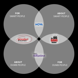
If you can’t communicate the underlying relationships to your audience, it doesn’t matter how much you know about your data. Here are some well communicated, if not terribly important, depictions of common and separate sets.
Regression Visualization Widgets
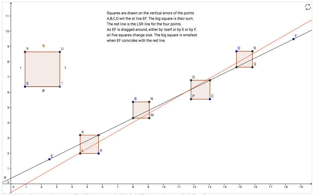
These are very handy for wrapping your head around what we’re doing when we find the regression line/least square line/line of best fit.
Here’s an applet for seeing what the line of best fit is doing.
And here’s an interactive explanation of least squares.
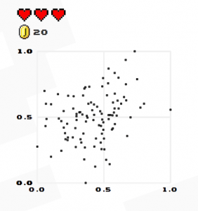
Play “Guess the Correlation”!
Fisher, Bigfoot, and the null hypothesis
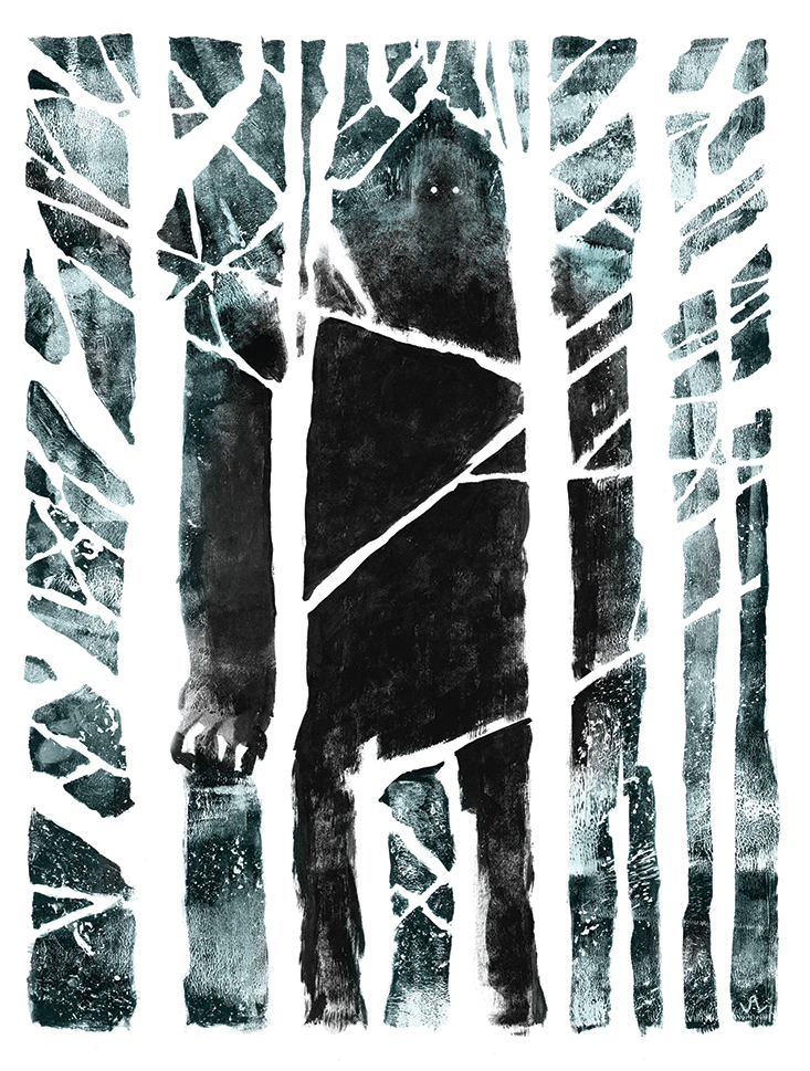
Here’s a reprint of a short 2014 Nautilus article by Carl Zimmer in which he describes how Ronald Fisher and some colleagues came up with the idea of testing null hypotheses in the 1920s. The story begins with pouring milk in tea, and one upshot is that we can’t definitively rule out the existence of Bigfoot.
Dear Data
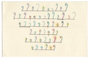
We’re looking at charts and graphs of various types this week. Check out the clever and charming Dear Data project. The authors provide many examples of how multiple variables can be reported simultaneously in an appealing, comprehensible way.
The Dude Map
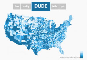
Take a look at this map showing how American men refer to their bros in different parts of the country. Oh, the ideas we can quantify!
Welcome!

You have found the syllabus for the course! We are going to be using an A/B Group format for class this semester. Make sure you know which group you are in, so you know whether to come on Tuesday or Thursday the first week of class! Students will not be admitted to the room if it’s not their group’s day to attend in person.